[yoast-breadcrumb]
Welcome to Google’s New News Feed.
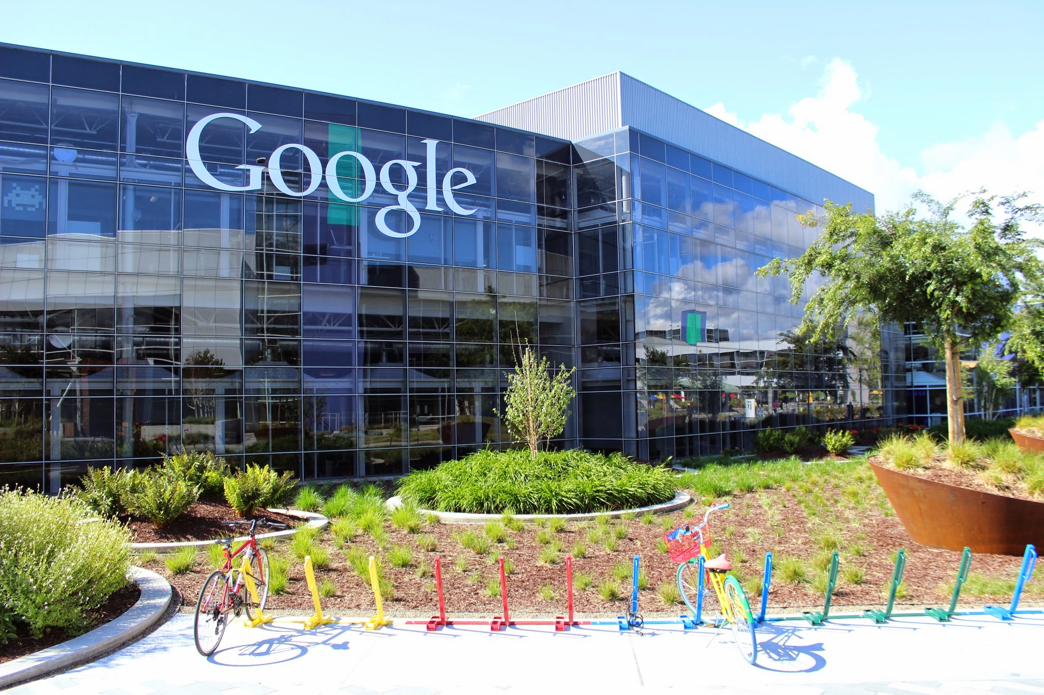
Google News is looking different today. That’s because Google today launched a major redesign of its news aggregation site that brings it in line with the rest of its services and removes a lot of the clutter that accumulated over the years.
After years of sticking with essentially the same design, nobody was going to accuse Google News of looking modern. While the rest of the company’s portfolio received major facelifts in recent years, Google News started looking a bit neglected (and cluttered). That’s all changing today.
Anand Paka, the product manager for Google News, told me that the guiding idea behind the redesign was to build an uncluttered user interface that makes the product more accessible to mainstream news consumers.
To do this, the team adopted a card-based interface for the main news stream, for example, and added tabs that separate the main headlines of the day from local news and the personalized news feed. Gone, too, are most of the longer snippets of text that featured prominently in the old design, as well as the share buttons for Facebook, Twitter and (gasp!) Google+ that would fade in when you hovered over a story (these have been replaced by a modern share button).
In terms of core features, though, you won’t see any major differences between these two versions. All of the new tools Google added in recent years, including real-time coverage, fact checks and support for videos, remain in place. Indeed, the team expanded the use of video in Google News, which makes sense, given how many recent stories now center around video.
Paka argues that Google’s users are already familiar with the card interface, so this shouldn’t be too much of a leap for most users. As in the old design, you can click on these cards to see an expanded view of the story with more sources and, if warranted, videos, fact check articles and more.
The team decided to give local news its own tab because it wanted to have space to expand this section over time. “We’re setting the stage for the next phase,” Paka explained. That’s something Paka noted a number of times during our conversation. The idea here is clearly to give the product team the ability to iterate on this design, and Paka also noted that we’ll see quite a few A/B tests over the next few months as the team looks at what works and what doesn’t.
Publishers won’t have to make any changes as to how they submit their stories to Google News, by the way. This update doesn’t introduce any changes for them, as all of the updates are happening above the publishing index. The renewed emphasis on video, though, will likely drive more publishers to invest in that side of their business.
Source: TechCrunch Read More
Email Us.
info@shore-media.com.
email us & we will get back to you.
Give Us A Call.
Call: 0121 663 1849
lines open 9:00am until 5:30pm Mon-Fri.
Social With Us.
Twitter / Facebook / Google+ / Linkedin
we will get back to you ASAP.
Newsletter.
Sign-up here »
latest news to your inbox every month.

